My New LC Smith & Corona Standard
Many, many thanks to Rock Toews, the owner of Back Creek Books, who, when he acquired it, immediately e-mailed me to let me know that he had something that he thought I would like.
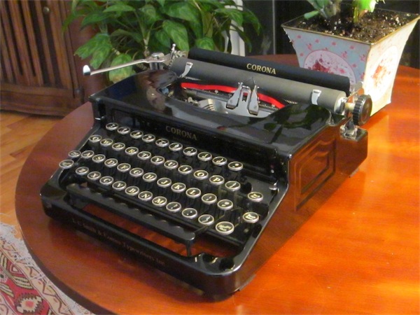
It is in beautiful shape inside and out, leading me to think that it had probably been professionally cleaned not long ago. It came with the original instruction manual, touch typewriting chart, and even the original cleaning brush. Needless to say, I will scan these in (well, not the brush, obviously) and share them soon. And since the type faces are so clean, a typecast is surely in order.
While this machine is very quiet compared to my other typers, the sounds it makes are all in the deep bass range, like something from a big desktop typewriter, rather than a portable. Unlike the tinny, snappy sounds of my Royals and the downright banging of my Remmie, this one sounds sort of like like a giant rubber-coated cast-iron contraption pounding away in a padded room somewhere.
You can probably tell that I love the sounds it makes.
The Floating Shift is just brilliant, and it has the most positive, solid-feeling backspace key I’ve ever used. Backspace keys always seem to be wobbly and have a mushy feel. Not so this one — it’s as solid and crisp as a regular key.
And speaking of the keys, man, are they lovely. I can see why they are a favorite among keychoppers (may their fields be burned and salted and their women driven before them lamenting in torment). And they are comfortable, too. The shallow scalloping makes a difference.
I know the boxy flattop look isn’t for everyone, but for me it has a sense of purposeful elegance. It’s designed to be a working machine, and everything about it seems designed around the convenience of the user. It has lots of little quietly understated yet classily executed features — like the paper rollers that slide automatically based on the margin settings, a very nice touch that serves the function of keeping the paper against the platen while at the same time not obstructing the typer’s view of the page. But the rollers also have a sculptural curve to them, which is as much about aesthetic as it is about function. It’s those thoughtful little touches that I really appreciate, and which make me smile as I type on it.
Categorised as: Life the Universe and Everything | Typecasting
Comments are disabled on this post
Sweet! These are great typewriters.
The paper fingers on my flattop do not slide automatically with the margin settings; it sounds like a great idea but I’ve never encountered this myself.
“Paper fingers” — so that’s what they’re called! (Sounds like the name of a Pepperidge Farm cookie, doesn’t it?)
Looking back on my description I realize that, in my haste to post, I didn’t describe the action clearly.
As the carriage moves forward when typing and backward when starting a new line, the the type guide pushes the fingers into position on either side. The margin settings don’t really have anything to do with it beyond establishing the maximum distances the fingers can be pushed.
It’s a darn clever way to keep the rollers out of your way while still keeping them on the paper.
Congratulations. Sounds like you have a really fantastic machine. I look forward to the typecast.
That’s a pretty machine! Congratz!